When building a block, you can define what elements should and should not be editable from the email builder using the editable, editable-fields, and editable-styles attributes. This lets you make blocks more reusable while being able to establish guardrails for elements that should not be altered.
Editable
The editable attribute allows an element to be changed in the email builder, and is required for editable-fields. It is also required for editable-styles if Enable Editable Styles is not enabled in the theme. Marking a field as editable also allows the content to be localized at the email level. Without this, the element will not be editable in the email builder, and any changes will have to be made in the block itself. Used alone, it allows all text-based content for an element to be edited (content, image source, link url, etc). Refer to the DML docs to see which fields of an element can be edited.
<dys-block>
<dys-row>
<dys-column>
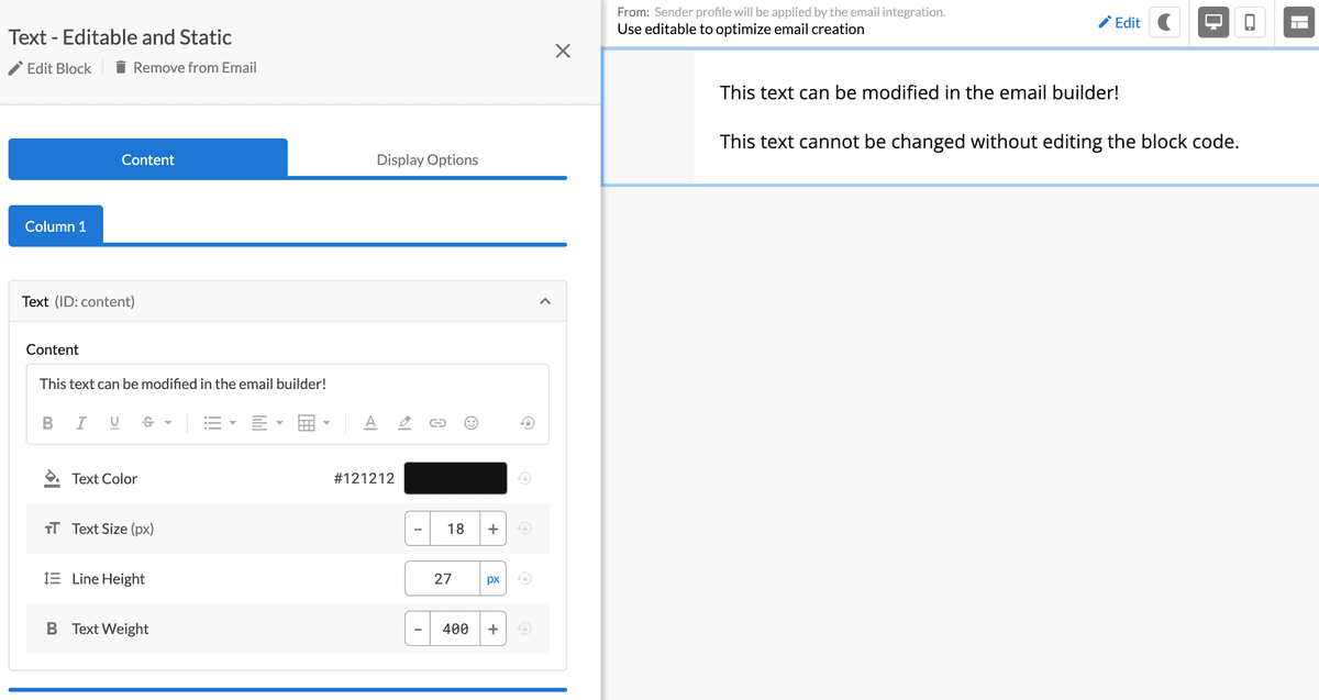
<dys-text editable="content">
This text can be modified in the email builder!
</dys-text>
<dys-text>
This text cannot be changed without editing the
block code.
</dys-text>
</dys-column>
</dys-row>
</dys-block>
Editable-fields
For some blocks, you may want more specific control over what content can be changed. If you want to allow edits to some but not all fields of an element, you can do that by using editable-fields. This lets you define which fields you want to make editable, rather than allowing everything to be changed — for example, if you want someone to be able to edit the text of a link or button, but not the URL. To see which fields of an element can be edited, check the DML docs.
<dys-block>
<dys-row>
<dys-column>
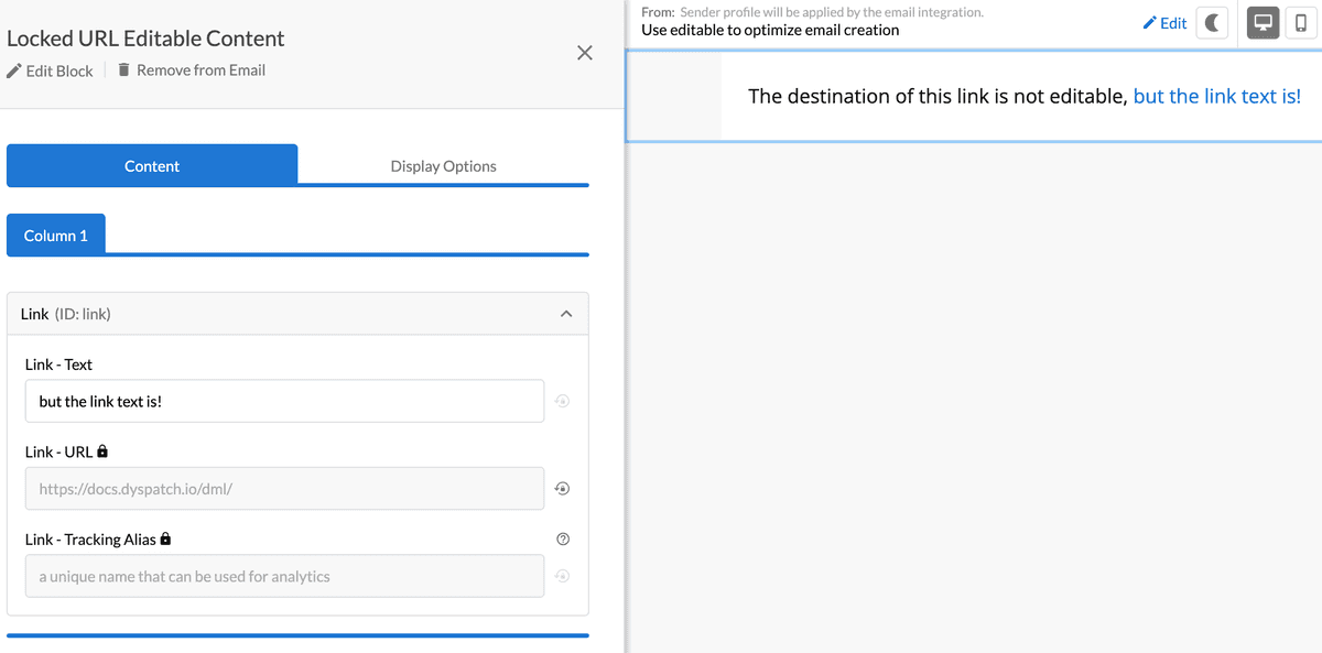
<dys-text>
The destination of this link is not editable,
<a href="https://docs.dyspatch.io/dml/"
editable="link"
editable-fields="content">
but the link text is!
</a>
</dys-text>
</dys-column>
</dys-row>
</dys-block>
Editable-styles
In addition to an element’s text-based content, you can also allow some style elements, like colors, to be changed in the editor by using editable-styles. Currently, this is available for dys-text, dys-title, dys-button, dys-img and dys-row. This lets you make your blocks more reusable - if you need a red button for one email and a green button for another, you can set editable-styles and use the same block for both.
In the email builder, users will be able to change the attributes that have been defined in editable-styles.
<dys-block>
<dys-row editable-styles='background-color' editable='row'>
<dys-column>
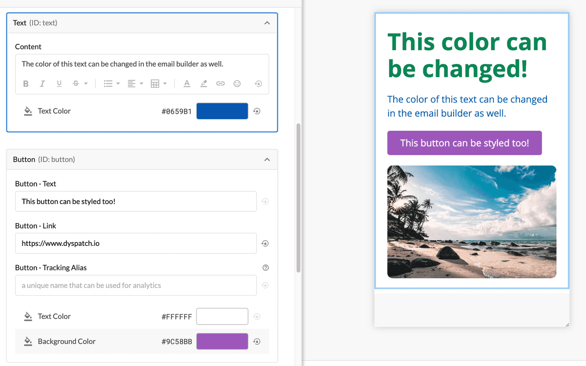
<dys-title editable-styles='color' editable='title'>
This color can be changed!
</dys-title>
<dys-text editable-styles='color' editable='text'>
The color of this text can be changed in the email builder
as well.
</dys-text>
<dys-button editable-styles='color,background-color'
editable='button'>
This button can be styled too!
</dys-button>
<dys-img src="https://imagelink.filetype"
editable="image"
editable-styles="height, width" />
</dys-column>
</dys-row>
</dys-block>
Theme-Level Style Controls
In addition to defining editable-styles at the block level, theme administrators can use Style Controls to set global rules for which styles are editable across all blocks in a theme. Learn more about configuring Style Controls.
Precedence Rules:
When both theme-level Style Controls and block-level editable-styles are used, the block-level attribute always takes precedence:
- Theme Style Controls - Global rules for all blocks (e.g., padding disabled for all columns)
- Block-level editable-styles - Specific rules for individual elements (e.g., editable-styles='padding' on a specific column)
If a block explicitly declares editable-styles='padding' on an element, that style will be editable in the email builder even if padding is disabled in the theme's Style Controls.
<!-- Theme has padding disabled for dys-column in Style Controls -->
<dys-block>
  <dys-row>
    <dys-column editable='column1'>
      <!-- Padding NOT editable (follows theme Style Controls) -->
    </dys-column>
    <dys-column editable='column2' editable-styles='padding'>
      <!-- Padding IS editable (block-level override) -->
    </dys-column>
  </dys-row>
</dys-block>Editable-group
Editable group should be used when your email designs need custom styling or content between desktop and mobile, and some editable content needs to be synced, such as text. Using dys-desktop and dys-mobile as covered in Part 2 of the DML 101 Guide, create tailored device size styling and link editable content by including the editable-group attribute to elements with the same value. In the email builder, users will be able to change the content on the desktop or mobile versions of the element and the content will automatically sync.
<dys-block>
  <dys-desktop>
    <dys-row editable-styles='background-color' editable='row-desktop'>
      <dys-column>
        <dys-title editable-group='title' editable-styles='color' editable='title-desktop'>
          The titles are grouped
        </dys-title>
        <dys-img editable-styles='height,width' src='https://imagelink.filetype' editable='image-desktop' />
      </dys-column>
    </dys-row>
  </dys-desktop>
  <dys-mobile>
    <dys-row editable-styles='background-color' editable='row-mobile'>
      <dys-column>
        <dys-title editable-group='title' editable-styles='color' editable='title-mobile'>
          The titles are grouped
        </dys-title>
        <dys-text>
          The mobile version includes text instead of an image
        </dys-text>
      </dys-column>
    </dys-row>
  </dys-mobile>
</dys-block>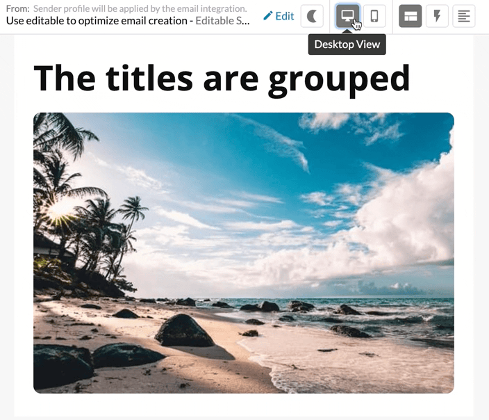
See all DML components and their attributes in our DML documentation.
Video Walkthrough
Want to see our editable styles in action? Check out our video walkthrough!