# Part 2: Advanced Structures & Elements
Explore more powerful DML capabilities for building complex, responsive email blocks with advanced layout patterns and components. This section focuses on extending basic structures into more flexible and customizable designs.
# Structures
In [Part 1](/dml_101/part1_basics), we discussed the basic structural elements of a DML block and some of their default settings and behaviors. In this part, we will cover ways to modify that default behavior, so that you can take more direct control over the layout of your email.
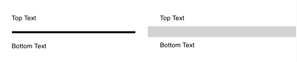
## dys-divider & dys-spacer
Use these to create a divider line or add extra vertical space to your layout. Check the DML Documentation, linked above, for details on which attributes are available to be modified.
```
Top Text
Bottom Text
Top Text
Bottom Text
```
View in
DML Playground
```
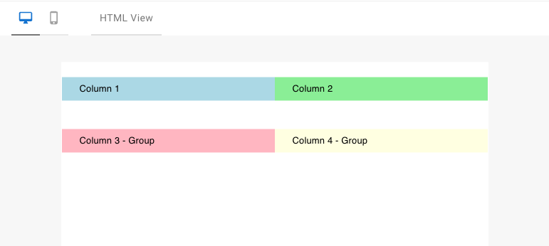
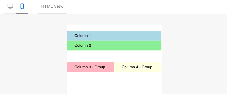
Column 1
Column 2
Column 3 - Group
Column 4 - Group
```
Desktop:
Mobile:
View in
DML Playground
```
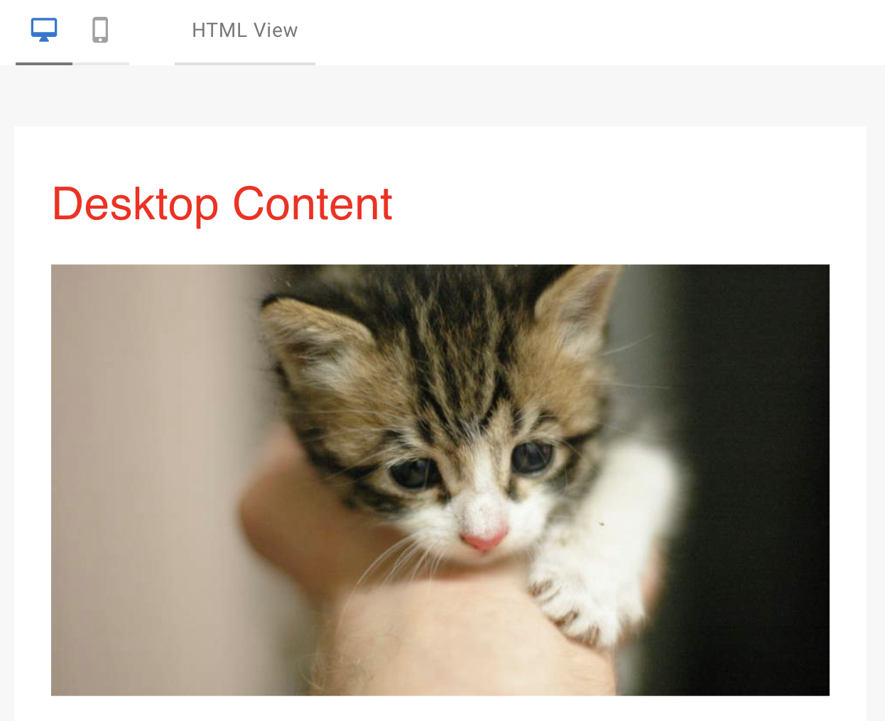
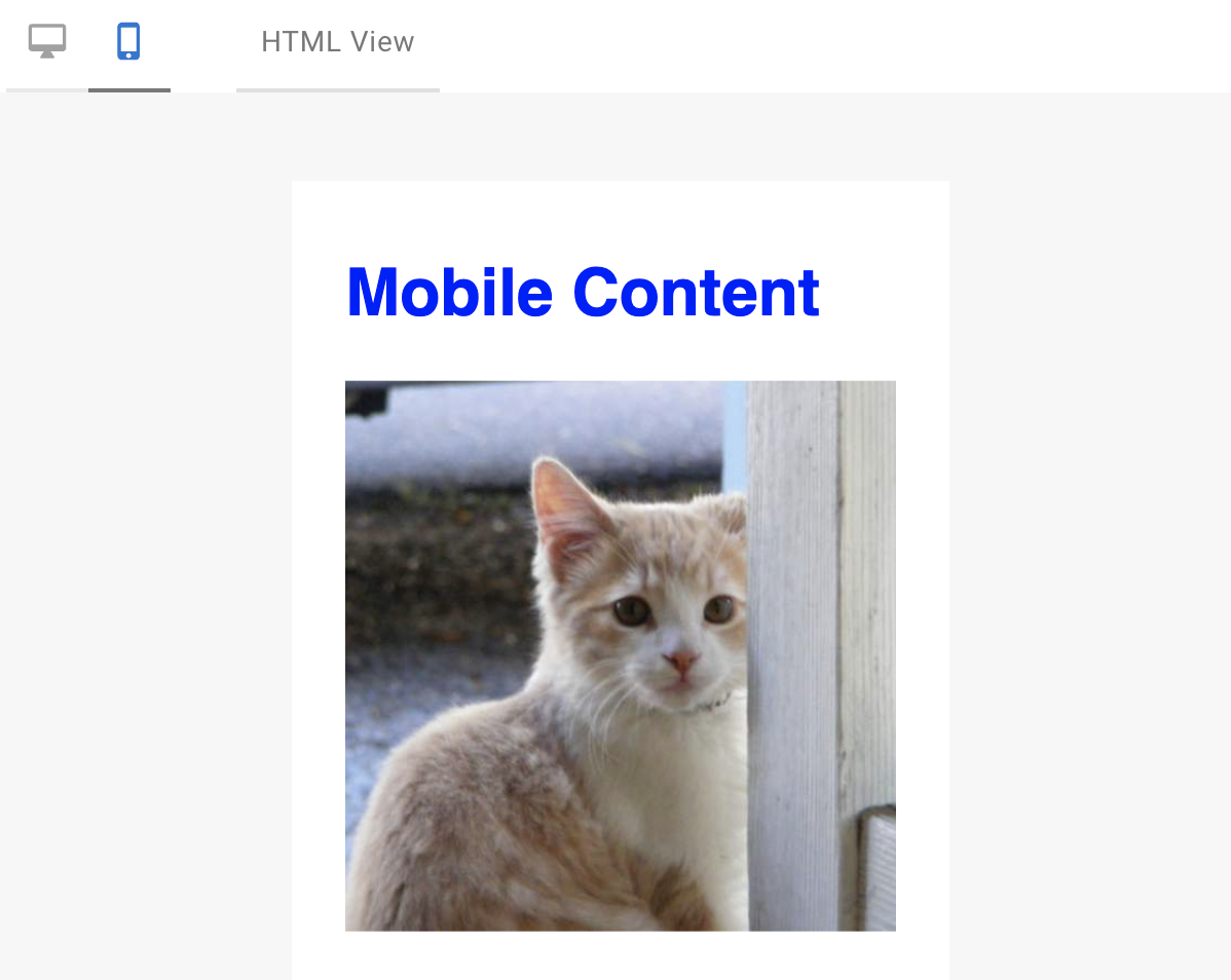
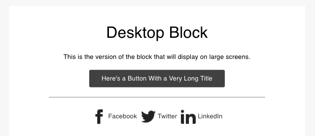
Desktop Content
Mobile Content
```
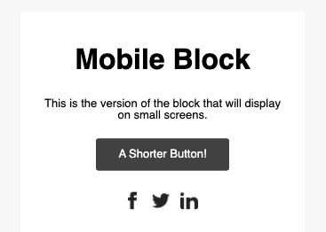
Desktop:
Mobile:
View in
DML Playground
```
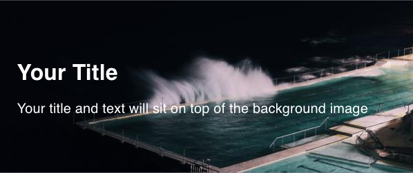
Your Title
Your title and text will sit on top of the background image
```
View in
DML Playground
```
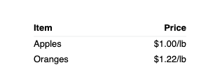
|
Item
|
Price
|
|
Apples
|
$1.00/lb
|
|
Oranges
|
$1.22/lb
|
```
View in
DML Playground
Desktop:
Mobile:
Desktop:
Mobile:
 View in
  View in